Olympus Medical
Positioning a smarter, safer solution for hospital hygiene
Art Direction • Identity • Motion • Design
-
When people think of medical technology, they rarely think about the people operating it. Yet in decontamination units across the UK, specialists make critical decisions every shift. Decisions that carry real clinical and compliance weight. Olympus, a global MedTech leader with over a century of precision behind them, asked us to help launch their new ETD reprocessing washer with a campaign that honoured that reality and positioned a technically superior product as something more: a tool built around the people who depend on it most.
Challenge
The launch wasn't simply about awareness, it was about shifting behaviour. Convincing an established customer base to upgrade, while simultaneously winning over new buyers who hadn't yet committed. And doing both at once, across two audiences who speak entirely different languages: the decontamination specialists whose daily pressures shaped every product benefit, and the decision-makers weighing regulatory compliance, environmental performance, and operational ROI.
Approach
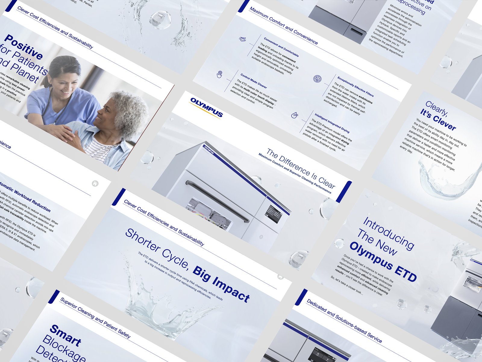
The answer was empathy. Rather than leading with specification, we elevated the daily pressures specialists face and positioned the ETD as the tool that has their back. "The Difference is Clear" became both a product truth and an emotional statement. Functional proof points and business-level priorities sat within the same creative idea, making it legible as a technical upgrade to the people using it, and a strategic investment to the people signing for it. The visual language did the rest: deliberately elevated, precise, and assured enough to signal category leadership.